28Oct1:38 pmEST
The Spookiest Chart of Them All

I suppose I could throw up a chart of VRX, some of the biotechs, CMG UA, or perhaps some macro indicator with a small sample size of why equities are in trouble.
But, in reality, the election, equities, macro data, and many other news headlines may be masking the biggest issue of them all, one we have been slowly tracking for a good while now.
And that issue would be the potential end of a mega, multi-decade bull run in Treasuries amid sinking rates.
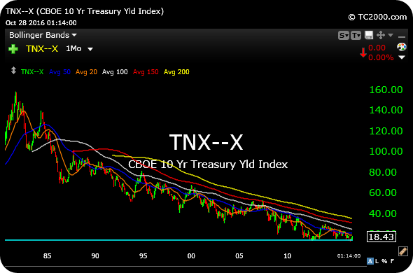
On the TNX monthly chart, below, which tracks yields on the 10-year note, the potential for a massive double-bottom in rates since the Bernanke years of 2012 is very much in play. When you factor in the harsh selling in REITs, utilities, and homebuilders of late, contrasted to the strength in the U.S. Dollar and banks, the puzzle for higher rates begins to fit more neatly together.
Moreover, regarding sentiment, there seems to be a general acceptance that rates simply must stay lower for longer, because that is what The Fed seems to want. But, again, the hidden issue there is whether we see the market revolt against The Fed and eschew "what they want."
Without question, this thesis remains a work in progress, as we need to see rates on the 10-year rise back over 3% before the notion of bond vigilantes at work can hold more water. But if that should happen I expect to see volatility in most asset classes, especially equities, begin to finally spike higher...and stick a bit more.
I will flesh out this issue, as well as the accompanying sectors within equities, for Members over the weekend in my Weekend Video Strategy Session.