
29Dec1:47 pmEST
One Final Chart for 2023

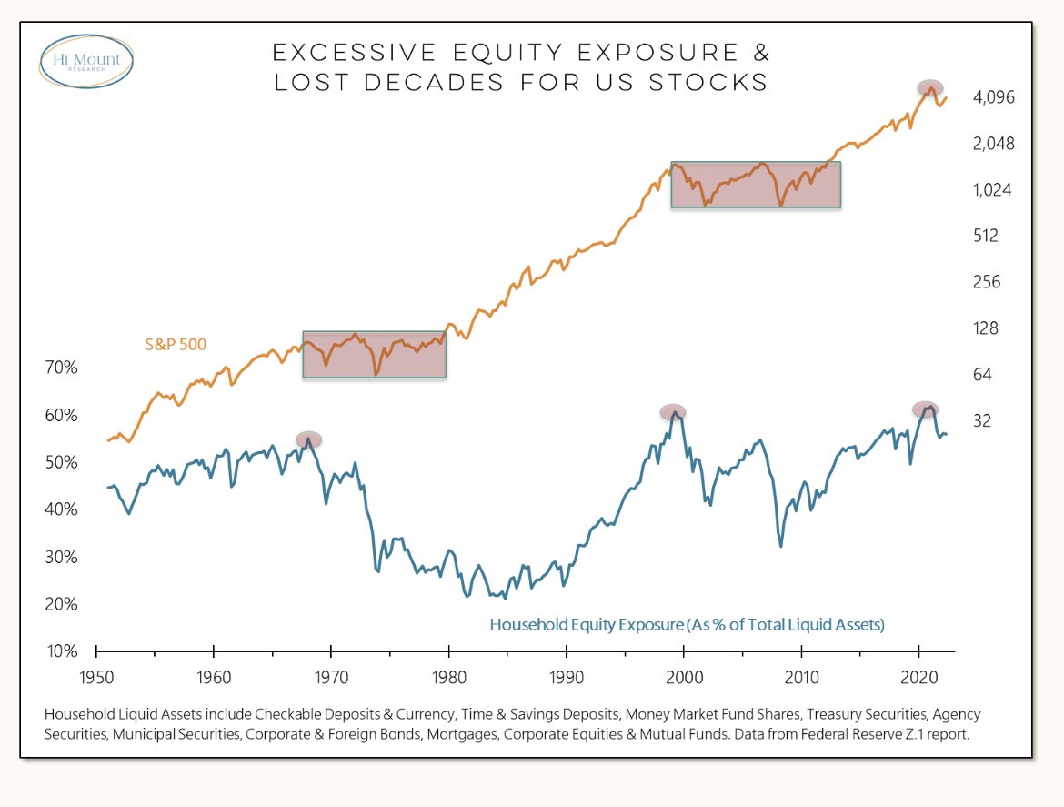
Courtesy of Hi Mount Research, the chart below has been making the rounds on Twitter of late.
Here we can see that when we have excessive equity exposure, on a historical basis, by households, it leads to prolonged periods of sideways/down markets as a contrarian measure.
There can be a little of a lag before this kicks in, as we saw with the peaks in the late-1960s/early-1970s, and then the Dot-Com Bubble at the turn of the century.
But after the melt-up in 2023 it sure seems like the lag has already run its course. And, clearly, households are excessively exposed to stocks, once again, as you can see below.
As noted here and with Members, I view this market setup much more in terms of the Nifty Fifty Bubble from the late-60s/early-70s, rather than the 2000 or 2008 tops. Back then, we were at the outset of a prolonged inflation in this country after about four prior decades of perpetual disinflation or deflation. Sound familiar?
The bottom line is that I remain firmly opposed to the "soft landing" view. If rates do go lower, it will almost assuredly be in the context of wildly bearish action in equities, though I still maintain higher rates will come first.
Stock Market Recap 01/25/21 ... Stock Market Recap 01/26/21 ...