04Aug12:05 pmEST
Spotting a Bloody, Sloppy, Diamond

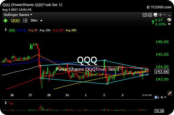
Dating back to some selling we saw last Thursday, the Nasdaq ETF's 30-minute chart, below, illustrates the sloppy nature of the action we have seen ever since.
Not only have we seen some prominent growth winners this year take a pounding after earning, namely AAOI and COHR in the chip space, but a lingering divergence with the Dow Jones Industrial Average masking general sloppiness below the surface has made swinging longs all the more tedious and perhaps not worth the trouble until conditions improve.
At the same time, bears continue to lack the necessary intestinal fortitude to take the above factors and run with them to inflict some downside energy in the market.
And the net result is the QQQ chart on that 30-minute timeframe, where price is forming a rather sloppy "diamond" pattern during the dog days of August.
Our focus for Members is to not make trades out of boredom, as is often the case for many traders in August. We want to remain flexible but tight as the Dow makes one new all-time high after the next on a daily basis and is celebrated by the mainstream news media.
However, for everyday market players and pundits this sure seems to be far from a clean celebration.