21Jun10:54 amEST
Two Charts to Help Shape Your Strategy

Despite prominent chip player Micron rallying after earnings, plenty of tech names reversed lower fairly sharply this morning. In addition, small caps, which we know have been extending higher for a while now, are also soundly in the red as I write this and are likely taking a long overdue breather. Even Netflix is showing signs of fatigue which, again, is not too surprising given its steep rally.
None of the above points amount to a particularly bearish case looking out the next few weeks or months. But perhaps for the next few days we will see the action cool off as the month and quarter wind down.
However, the large cap financials are a bit more concerning.
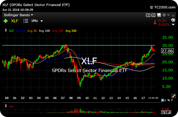
We have previously observed the long-term XLF (sector ETF for those large cap banks) chart, updated first below, regarding the concept of "overhead supply" or resistance, and surmised that the pre-2008 Global Financial Crisis highs around $30 were significant enough to likely inflict a few months of resistance.
And indeed they have, with XLF correcting since late-January of this year.
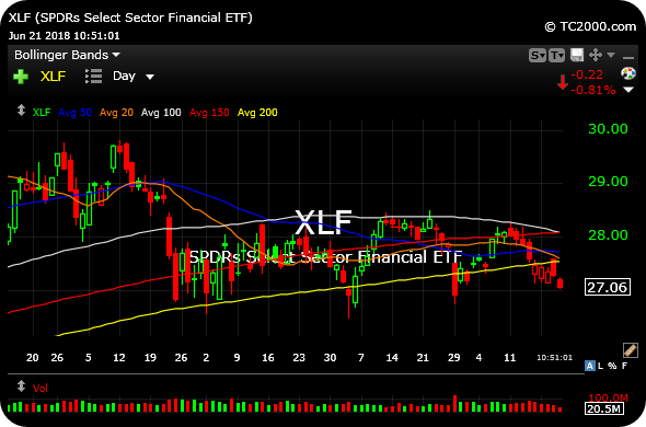
But the daily chart, second below, shows that XLF is nowhere close to a tradable bottom yet, as bulls have apparently failed on multiple occasions to defend the 200-day simple moving average (yellow line on, again, the second chart below).
Note how many opportunities bulls have had since March to make a stand at the 200-day, with diminishing returns setting in each time they tried. The major concern now is that buyers simply step away in disgust and the banks slide lower for a meaningful move down. If that materializes, I suspect the rest of the market will take notice in a much more pronounced way than anything we have seen in recent months.
At any rate, we have a careful eye on the banks here, as the major players like BAC C GS JPM MS WFC are all sporting heavy daily chart with little in the way of interested buyers, just yet.


Stock Market Recap 06/20/18 ... Stock Market Recap 06/21/18 ...


