09Feb3:32 pmEST
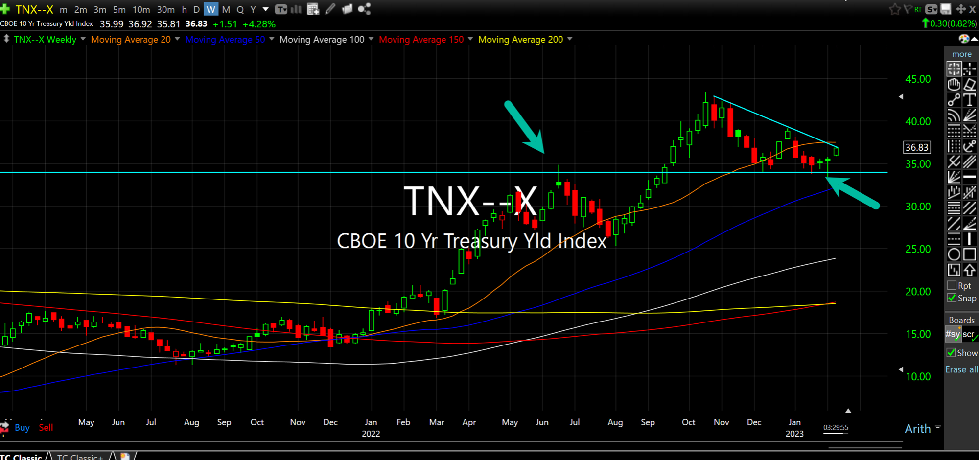
The Chart di Tutti i Charts

Are you sure rates have topped out?
No, I mean, like, really, really, sure?
Because if not, and you probably know I believe they will go much higher, many of the assumptions built into this risk-on rally in early-2023 can reverse rather ruthlessly.
On the weekly chart for TNX, which is the Index for rates on the 10-Year Note (the big round numbers correspond a decimal point over to the 10-Year Note rate, meaning 34 is about 3.4%), the case for a bull flag about to uncoil higher is a legitimate one.
Recall that rates have been in a four-decade downtrend since the early-1980s, which makes it totally understandable that folks expect same ol' same ol' insofar as rates sinking again.
But with entrenched inflation and a Fed Chair trying to massage out a soft landing, the risk as I see it is that rates move higher rather quickly in the coming weeks and catch a great many off-guard. In and of itself this can cause some dislocations give the wild repositioning so far this year.
The Dollar (we noted the Dollar/Yen earlier this week), Nasdaq, other charts, sure. They are important. Very much so, in fact.
However, if I had to choose one chart as the "capo" of the market, it has to be this one. Rates are in a new bull market and that means I presume this pattern resolves higher.